bradycandell.com BradyCandell.com
  • —
  • Career Timeline
  • Case Study

Case Study: The Moody’s Analytics Course Catalog

Case Study:

The Moody’s
Analytics Course Catalog

One of my primary responsibilities at Moody’s Analytics was to analyze their Learning Solutions course catalog, identify pain points and implement A/B testing with the goal of implementing improvements that increased the catalog’s performance based on our defined KPIs.

Below you will find the iterations I moved through as time passed and I continued to gather information and improve the experience. Ultimately I managed to increase the conversion rate by 38% on an annual basis.

Phase One
Phase Two
Phase Three
Phase Four

Use these buttons to explore the journey of this catalog from beginning to end.

Phase One – Analysis of the Legacy Catalog
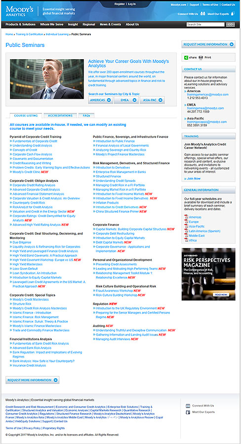
An image of the cluttered, overwhelming course catalog as it was in 2019

Catalog Analysis


  • A Comprehensive Listing – users looking for Public Courses can find them all in a single place.
  • Categorization – it is easy for a potential student to find the Category which probably houses their course.
  • Strong CTA – if the primary goal of the page was to have would-be students contact Moody’s, the “Request More Information” CTA is obvious and clear.
  • TMI – page visitors are almost guaranteed to be overwhelmed by the content on this page, it’s simply too dense to consume
  • Noise – The “NEW” element meant to draw the eye is so prevalent it becomes a distraction.
  • Search – or lack of it…if a user is trying to find a particular course or keyword, they must either use CTRL-F or the global site search.
  • Filter Scarcity – users will likely want/need to filter by type, difficulty, date, etc. Region is insufficient.
  • Registration – the primary goal of the page is to drive registration…and you can’t begin registering here.
  • MOBILE!! – this site (and thereby this page) is not mobile-friendly. (Analytics shows a whopping 49% of site visitors are on a mobile device.)

Phase Two – The First Solution

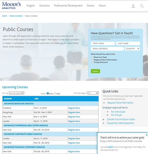
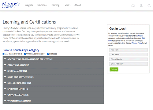
Courses by Name

View this page live here.

After studying the analytics and thoroughly reviewing the UX of the existing site, I reviewed the course page with stakeholders, identifying the recurring issues they perceived and created a prototype for review.  Upon approval, I built the page you see above.  
The sales department noted that a large percentage of their calls were to simply find out what the upcoming dates were for a particular course.  Also, as noted previously, almost all course registrations were also being handled via phone calls.  
Below you will find my evaluation of the improved page.

  • A Comprehensive Listing - This hasn't changed, users can still see the entire catalog at once.
  • Structure - The cluttered "wall of links" has been replaced with a structured table with shading that makes it easier to consume the content.
  • Registration - conversion to registration increased dramatically by adding a "register now" for each course date.
  • Contact - the secondary goal of the page, to have potential students fill out the contact form, saw a significant rise.  We found that most students who filled out the form intended to do so from the start.  Moving the form to the top of the page facilitated conversions.
  • Promotional Overlay - Bounce rates dropped dramatically and registrations rose exponentially with the inclusion of a time-sensitive discount in the form of an "Urgency Overlay".
  • Responsive - the page is more mobile-friendly, no need to "pinch and zoom" to consume content.
  • Content Saturation - There is still too much - and maybe even more - content on this page. Analytics showed an average scroll depth of 50%.  Users were experiencing content fatigue before finding the course that fit their needs.
  • Lack of Course Clarity - Feedback from sales showed that while many students know exactly which course they need, the majority need more information before registering.  This page still lacked any course information.
  • Mobile challenges - While the page now responds to screen width, the format isn't optimized for touch devices.
  • CTA Competition - Some users come to this page with other needs.  Stakeholders requested a "sidebar" to address these needs, with links to various assets.  Analytics showed this caused more confusion than utility.

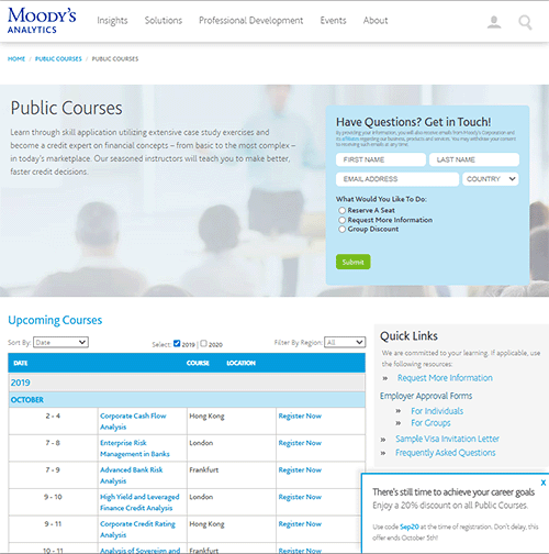
Courses by Date

View this page live here.

In addition to creating a new catalog with courses listed by Name, I created a "sort by" drop down that reorganizes the data into a new configuration that made it easy to view the courses by their session date. 

Sales informed me that many students often call saying they have a training budget that requires they attend the course before a certain date.  Adding the ability to easily view courses by date increased conversions by 18%.

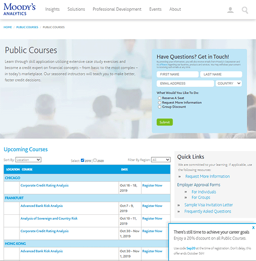
Courses by Location

View this page live here.

In addition to viewing the data sorted by course and date, information from the sales department indicated that many students were limited to training geographically, either by company mandate or personal preference.   By including a way to filter courses by region and sort courses by city, we further increased online conversions by 9%.

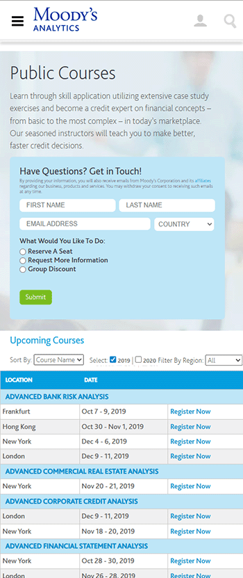
Mobile viewport sizes

View this page live here.

Interestingly, while analytics showed that nearly 50% of site visitors were on mobile, conversions skewed dramatically toward desktop users.  By creating a mobile-friendly version of the site, online conversions via mobile did NOT increase by an appreciable amount - BUT sales found the number of qualified leads - informed callers, dramatically increased.  We found that visitors HAD consumed the online data, and knew what they wanted specifically.   For mobile site visitors specifically, time on call and effort to convert decreased by nearly 43%.

Not a perfect solution, however, as our goal was to increase online conversions and reducing reliance on the sales team.

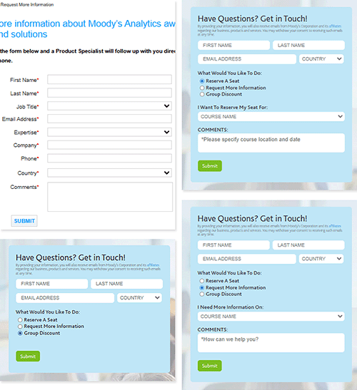
The form itself

View this page live here.

Including a form on the page itself rather than requiring a click-through increased form fills.  In addition, this form was specific to Learning Solutions, whereas the previous form was global.

We made a few more crucial form improvements:

  • Decrease the number of required fields
  • Show only relevant fields related to the user's inquiry
  • In the back end, route the form to the appropriate party which dramatically decreased response time.

Phase Three : the Second Solution – Improvements

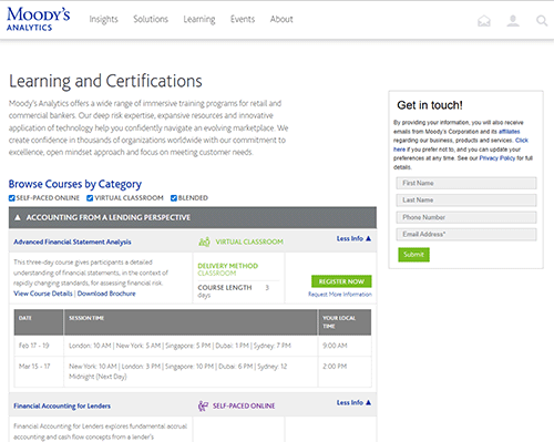
Course Catalog Minimized

View this page live here. While Phase Two showed great improvements over the Legacy Catalog, studying analytics, heatmaps, and feedback from the sales team highlighted a few areas needing improvement. Below you will find what worked well and what needed refinement.

  • A Comprehensive Listing - This hasn't changed, users can still see the entire catalog at once.
  • Category Segmentation - Feedback from the sales team informed us that a majority of prospective learners used the categories and were frustrated by the removal.
  • Comprehensive Catalog - Finally the page caters to all of our students - those attending in person, those attending virtually, and those who are combining the two in blended solution.
  • Integrated Resources - Analytics showed a large bounce rate, with a click-through to course details at 18%.  To simplify the student journey, stakeholders requested that all core actions be built into the catalog page - a summary, link to register, link to the course brochure, link to course details, and a course-specific information request form.  These resources lived in an expandable content box to streamline the page.
  • Fully Responsive - I utilized progressive reduction to provide mobile users an experience that fit the reduced screen size.
  • Content Saturation - Despite the expandable content sections, there is just way too much information on the page
  • Cognitive Overload - with the inclusion of links for everything the visitor might need, analytics shows users may have experienced decision paralysis - while time on page increased by 14%, bounce rates rose by 23%.

Course Catalog Maximized

Here you see the catalog in it's fully expanded state.  This was during the pandemic, so in-person courses became "virtual classroom" courses, where students attend an instructor-led course virtually.  For these courses, users could see the upcoming course dates and locations. In addition, the catalog now shows self-paced online courses - pre-recorded courses that students could consume at their leisure.

This approach provided everything a student could need before clicking register but as I previously noted, it was content overload.

Course Catalog – Mobile


Here you see the mobile experience in both minimized and expanded views. While the content is well organized and easy to engage with in its reduced state, the sheer volume of information and the need for extensive scrolling quickly lead to fatigue and abandonment.

Phase Four: The Final Iteration

animated card flip

Summary

View this page live here.

Most visitors came to the course catalog page with two primary goals: either to find and register for a course, or to reach out to someone for more information or help. The challenge was always the same: how do we give them everything they need without flooding them with too much, or starving them with too little?

To answer this, we had to consider what users were really looking for, how we could define their journey to conversion, and how we could design the page so that it took the weight off the sales department. Instead of requiring prospective students to call, the page itself needed to supply enough detail to let them register directly.

Quick Snapshot: Pain Points & Solutions

Pain Points Identified

  • Students only had a general idea (e.g., Commercial Banking) but not the specific course.
  • A simple list of titles was useless — clicking through individually was overwhelming.
  • Analytics showed low click-through, high bounce, and wandering behavior.
  • Sales was overburdened fielding basic course-clarification calls.
  • Students consistently asked for six key details: segment, channel, budget, certification path, duration, and summary.

Solutions Implemented

  • Introduced card-based course design: image, segment/channel, title, and banners upfront.
  • Card flip on hover revealed duration, summary, price, and clear CTAs (register or request info).
  • Added filters and sorting: by segment, channel, price, or alphabetically.
  • Used visuals and structured information to reduce cognitive load.
  • Created a self-service catalog that answered questions before sales ever got involved.

Results

  • Dramatic drop in bounce rates.
  • Significant reduction in calls to sales.
  • Increased scroll depth and click-through.
  • Achieved a 38% conversion rate.

Insights from Sales and Analytics

Sales teams discovered, through direct conversations with prospective students, that many visitors had a general idea of what they needed, but not a specific course in mind. This meant that presenting just a lis of course titles was useless. Expecting a student to click through to each title individually in order to discover what the course was about was unreasonable and frustrating.

Analytics and heat maps confirmed this: click-through rates were very low, bounce rates were severely high, and users wandered around the page without clear direction. The lack of structure left students with uncertainty, and the sales department with an overwhelming number of calls from confused leads.

Identified User Needs

By combining data analysis with stakeholder and student feedback, we identified several key pieces of information that prospective students required in order to make confident decisions:

  • Segment (Category) – While they might not know the exact course, nearly all students knew the broad category they needed (for example, Commercial Banking versus ESG and Climate).
  • Channel – Students definitively knew whether they wanted an instructor-led or self-paced elearning course.
  • Budget – Students wanted to know the price of the course.
  • Certification Path – Many students were working towards a certification – knowing which courses fit into a certain path was helpful.
  • Duration – Students often queried how long the course would take to complete.
  • Summary – In order to be sure this is the course they are looking for, almost all students wanted a basic summary before clicking through to registration.

This is a lot of information to provide and to consume. The biggest challenge after analyzing each progressive iteration of the catalog was to find a way to present all the requested information in an easy-to-consume manner that avoids information overload and fatigue.

The Solution: Card-Based Courses

The solution was to present the courses as cards, with only a small amount of visible information:

  1. An image – we found the “break” provided by images reduced the cognitive load and created a more enjoyable experience.
  2. Segment – virtual classroom (instructor-led), Self-Paced Online (eLearning), or a combination of both (Blended).
  3. Course Title.
  4. A banner designed to pique interest, such as “New” or “Popular” – this banner also designated Certification-pathed courses.

On hover, each course card would individually flip to present the visitor the rest of the information – now siloed in such a way as to feel less overwhelming:

  1. The Title.
  2. Duration.
  3. Course Summary.
  4. Cost.
  5. The two conversion paths:
    • A. Take the user to the course detail page where they can see all of the course dates and register.
    • B. Button to request information which pre-populates the form for ease of completion.

Reorganizing Information: Filters and Sorting

This solution presented the visitors with three simple means to consolidate and re-organize the information:

  1. Segment – view only the courses within a specific category.
  2. Channel – remove any courses that are not offered in the means the visitor wants to consume.
  3. Sorting – organize the courses alphabetically or by price.

Outcomes and Results

With all of these improvements, we saw a dramatic decrease in bounce rates and calls to the sales team, an impressive increase in scroll depth and click-through rate, and a whopping 38% conversion rate.

Copyright © 2025 · Genesis Child – DDC on Genesis Framework · WordPress · Log in